Completely new.
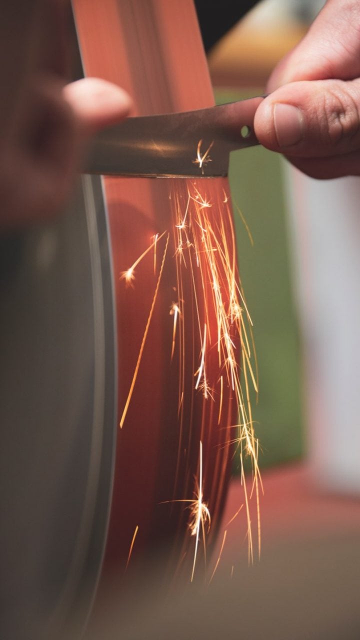
This is how well meticulous craftsmanship and modern industrial manufacturing can go together: with a fresh brand image and product catalogue, we show why the Messerfabrik Giesser has been unique since 1776.
Really good knives.
Giesser became aware of Wecause after reading our trade fair references, and approached us with the request to build a new trade fair booth for them. It quickly became apparent that we had a very wide-ranging brief which also involved pointing up the company’s next goal of developing its private-client business.

“We firstly sat down and analyzed the brand.”
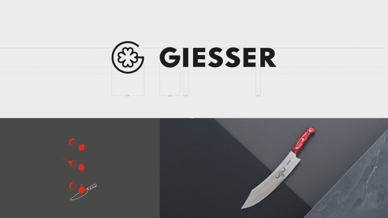
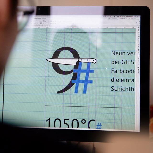
We reduced everything to zero. We started again right from the beginning with a comprehensive analysis of this venerable company. Because what Giesser needed was a clearly defined brand image – one which would serve as a guideline for all the next steps they would take. We therefore precisely defined what the real essence of Giesser Messerfabrik is, where it comes from, where it’s going, and what makes it unique. This intensive work, along with close collaboration with the Giesser brothers, gave rise to the new brand image, as well as a new corporate design which covered typography, color concept, visual language, and redesigning the logo.
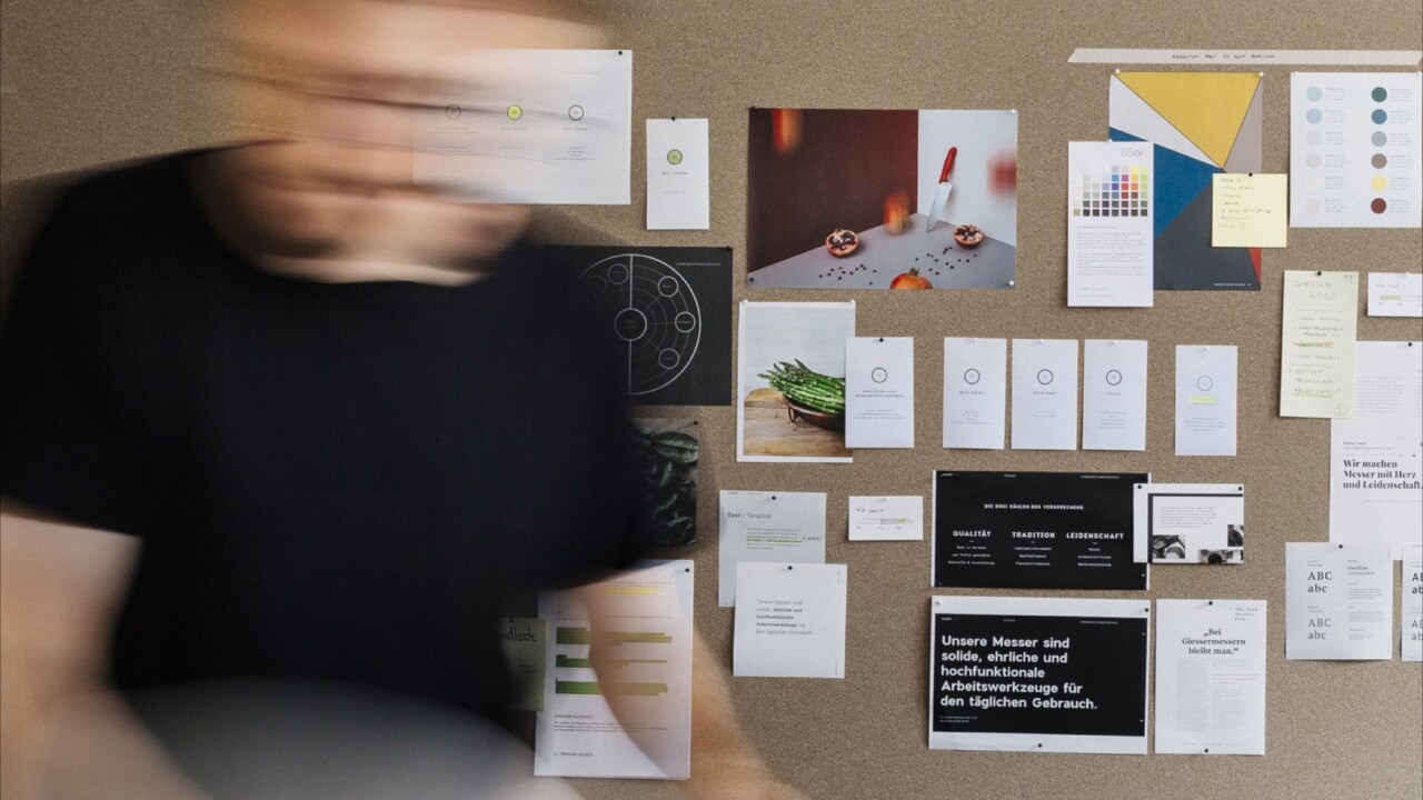

“From theory to practice – the product catalogue.”
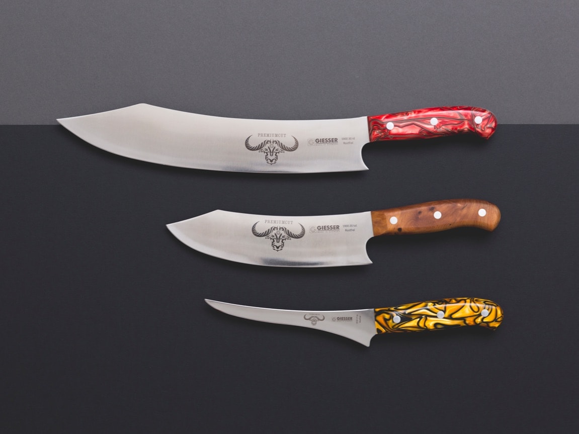
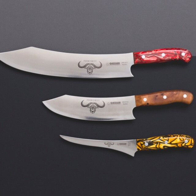
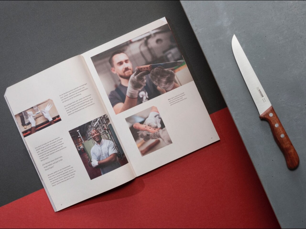
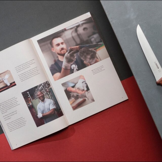
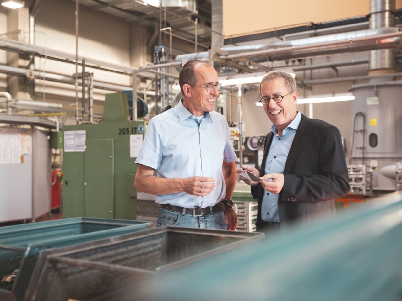
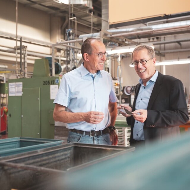
The guideline was implemented for the first time straight away with the redesign of the large product catalogue. Our concept entailed a revised two-part structure: an editorial section about the company with high-end graphics, and a product overview. This gave us space, alongside the classic product presentation, to create a profile of Giesser using employee portraits, and sketches of the corporate history.

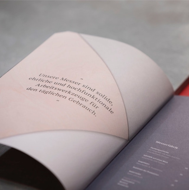
A smart navigation aid separated the editorial section from the product overview: we used different types of paper for each section. For the first we used a natural paper with a pleasantly warm feel, while for the second section we chose a coated paper that was more suitable for the neutral depiction of products. We also decided to cut off the corners on the upper right edges – this was not only an eye-catching feature but also made it possible to flip quickly from one section to the other.
“Interdisciplinary thinking and working – the Wecause principle worked out.”
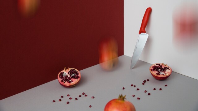
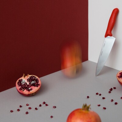
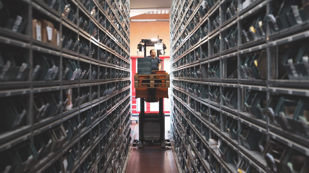
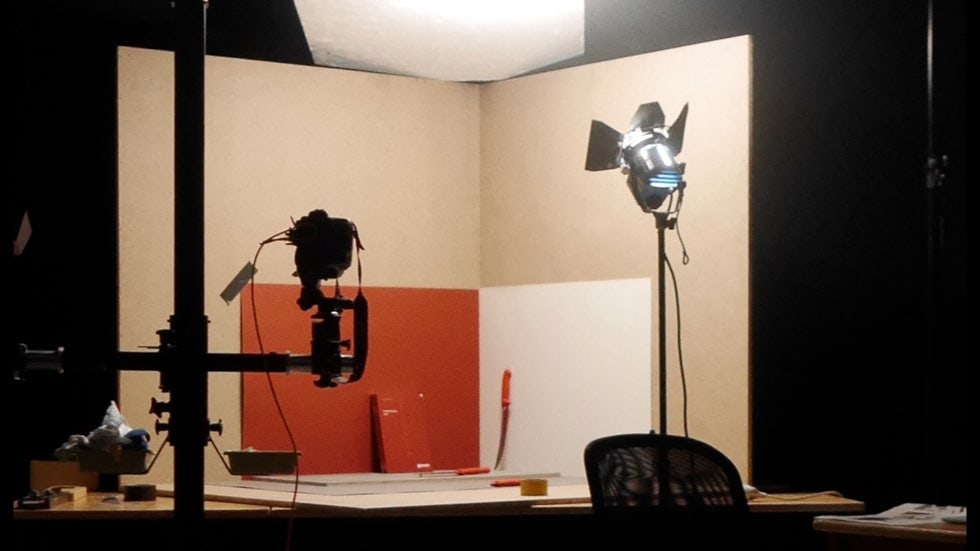
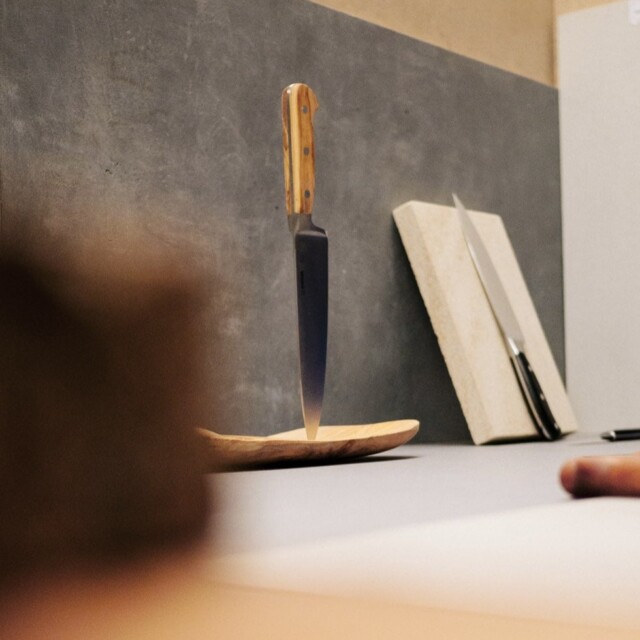
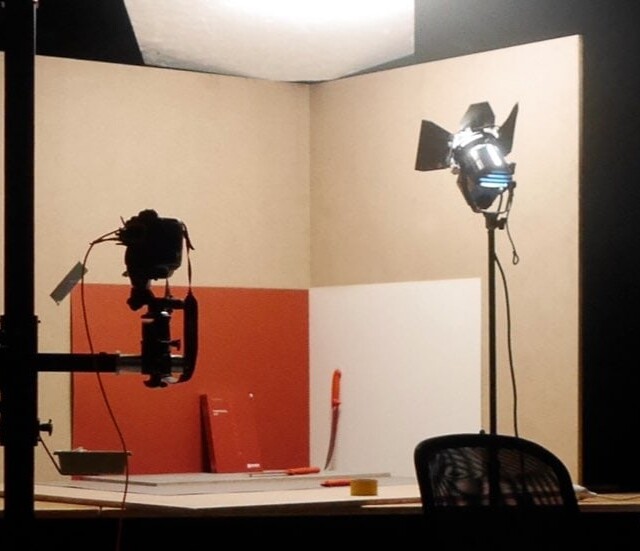
Since we integrated the photography right from the start of the project as an important part of the overall composition, it went hand-in-hand with our design and editorial work. We oversaw production and created portraits of the people behind the brand. Parallel to that, in our studio we produced the product photos that fitted perfectly into the layout.

„Happy Client – happy Wecause.”
The concept worked, and the feedback was entirely positive. The Giesser brand benefits from a new brand image, and the target group is celebrating it. But for us, that’s just the start…
Stay tuned.